Eskilstuna Municipality
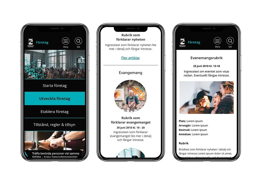
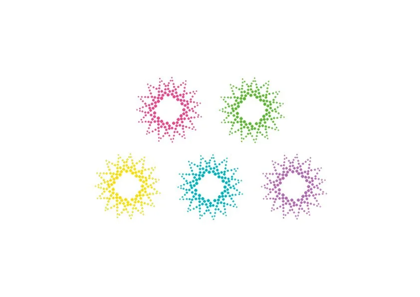
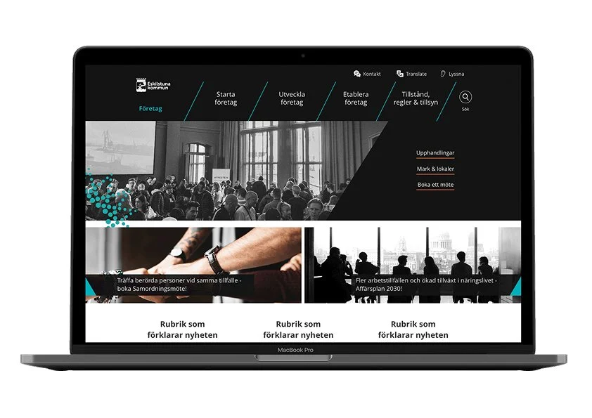
Eskilstuna Municipality wanted to redesign their website, dividing it into a main site and four sub-sites. My role was to develop a style guide applicable to all websites and create a graphic symbol library. One key challenge was designing a new color palette based on Eskilstuna’s existing print colors, adjusted to meet web and WCAG 2.0 AA accessibility standards.
The star, a central part of Eskilstuna Municipality’s brand identity and a well-recognized symbol in the community, was incorporated into the new design. To give each website its own identity, we assigned a unique star color to distinguish the sites.
Södersjukhuset
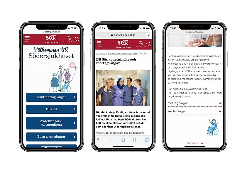
Södersjukhuset Hospital in Stockholm needed a new website, as their existing one was not responsive and included over 2000 unvisited pages.
In collaboration with a UX designer, I conducted user tests with hospital staff and visitors to gain a deeper understanding of their needs and requirements for the new website. Based on this research, we developed design concepts that meet web and WCAG 2.0 AA accessibility standards.
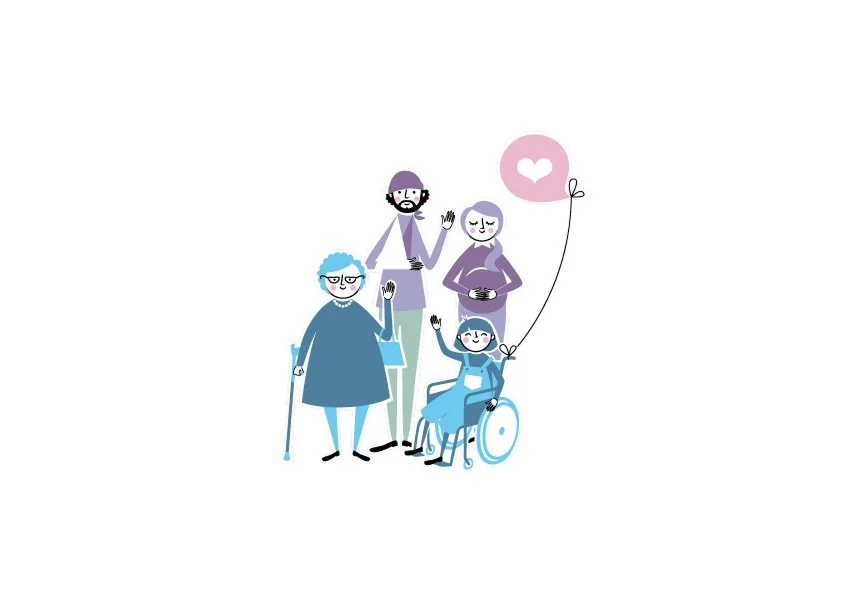
To create a friendlier and more welcoming look, we incorporated illustrations from the hospital’s internal staff magazine into the website design. This approach added a personal touch while maintaining alignment with the hospital’s identity.